
上下布局
html,body{height: 100%; margin: 0px; padding: 0px;}
/* 上下布局 */
.col-flex{
display: flex;
flex-direction: column;
height: 100%;
}
.col-flex .col-flex-grow{
flex-grow: 1;
overflow: auto;
}
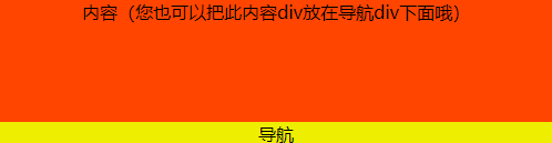
<!-- 上下布局 -->
<div class="col-flex">
<div class="col-flex-grow" style="background-color: #FF4500; text-align: center;">内容(您也可以把此内容div放在导航div下面哦)</div>
<div style="background-color: #EEEE00;text-align: center;">导航</div>
</div>
左右布局

/* 左右布局 */
			.row-flex{
				display: flex;
			}
			.row-flex .row-flex-grow{
				flex-grow: 1;
			}


<!-- 左右布局 -->
		<div class="row-flex">
			<div style="background-color:#EEEE00;">导航<br>导航<br>导航<br>导航<br>导航</div>
			<div class="row-flex-grow" style="background-color: #FF4500;">内容(您也可以把此内容div放在导航div左边哦)</div>
</div> 上一篇:bootstrap4常用样式
下一篇:没有了
讨论数量:0