
本篇整理下前端UI框架fomantic弹出框Modal的使用,主要是了解一些参数使用,如以下弹出窗参数:
closeIcon:关闭按钮图标
allowMultiple: 允许同时弹出多个窗口
closable :关闭点击遮罩关闭窗口
inverted: 反向显示遮罩
dimmerSettings: 自定义遮罩效果
blurring:底变模糊
centered: 居中显示
keyboardShortcuts:关闭按键Esc
class:窗口大小 mini/tiny/small/large/fullscreen/overlay fullscreen
transition:动画效果:scale/zoom/fade/fade up|down|left|right/horizontal flip/vertical flip/drop/fly up|down|left|right/swing up|down|left|right/browse/browse right/slide up|down|left|right/,默认scale
title:窗口标题
classTitle:标题样式
content: 窗口内容
classContent: 内容样式
actions:窗口底部按钮,按回车键默认点击第一个按钮
classActions: 窗口底部按钮样式
onShow:窗口打开前回调
onVisible: 窗口打开后回调
onHide:窗口关闭前回调
onHidden:窗口关闭后回调
onApprove: 按下确定按钮调用
onDeny: 按下取消按钮调用
实例代码:
$.modal({
//closeIcon: true, //关闭按钮图标
//allowMultiple: true, //允许同时弹出多个窗口
//closable : false, //关闭点击遮罩关闭窗口
//inverted: true, //反向显示遮罩
//dimmerSettings: { variation: 'inverted', closable : false, useCSS : true }, //自定义遮罩效果
//blurring: true, //底变模糊
//centered: false, //居中显示
//keyboardShortcuts: false, //关闭按键Esc
class:'mini', //窗口大小 mini/tiny/small/large/fullscreen/overlay fullscreen
//transition:'fade down', //动画效果:scale/zoom/fade/fade up|down|left|right/horizontal flip/vertical flip/drop/fly up|down|left|right/swing up|down|left|right/browse/browse right/slide up|down|left|right/,默认scale
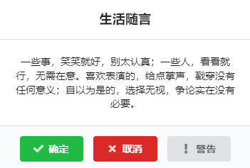
title: '生活随言', //窗口标题
classTitle: 'centered', //标题居中显示
content: res.msg, //窗口内容
classContent: 'centered scrolling', //内容居中显示,超出显示滚动条
//窗口底部按钮,按回车键默认点击第一个按钮
actions: [{
text: '确定',
class: 'green approve',
icon: 'check',
},{
text: '取消',
class: 'red cancel',
icon: 'times',
},{
text: '警告',
icon: 'exclamation',
click: function(){ $.toast({message:'警告按钮不能关闭窗口哦!'}); return false; }
}],
classActions: 'centered', //窗口按钮居中
//onShow: function(){ alert('窗口打开前提示'); }, //窗口打开前回调
//onVisible: function(){ alert('窗口打开后提示'); }, //窗口打开后回调
//onHide: function(){ alert('窗口关闭前提示'); }, //窗口关闭前回调
//onHidden:function(){ alert('窗口关闭后提示'); } //窗口关闭后回调
onApprove: function(elem){ $.toast({message:'您按了确定按键'}); }, //按下确定按钮调用
onDeny: function(elem){ $.toast({message:'您按了取消按键'}); } //按下取消按钮调用
}).modal('show');
以上实例运行效果如下:
还有就是我们常用的的三种窗口alert提示窗口、confirm询问窗口、prompt输入窗口
alert实例代码:
//实例一:
$.modal('alert','<span class="ui big purple text">hello</span>');

//实例二:
$.modal('alert','Watch out','This is an important message!');

//实例三:
$.modal('alert',{
   title: 'Listen to me',
   content: 'I love Fomantic-UI',
   handler: function() {
     $.toast({message:'Great!'});
   }
 });
confirm实例代码:
//实例一:
$.modal('confirm','Attention!','Ready?');

//实例二:
  $.modal('confirm','Attention!','Ready?', function(choice){
    $.toast({message:'You '+ (choice ? 'Accepted':'Declined')});
  });

//实例三:
  $.modal('confirm','Ready?', function(choice){
    $.toast({message:'You '+ (choice ? 'Accepted':'Declined')});
  });

//实例四:
  $.modal('confirm',{
    title: 'Ready?',
    handler: function(choice){
      $.toast({message:'You '+ (choice ? 'Accepted':'Declined')});
    }
  });
prompt实例代码:
//实例一:
 $.modal('prompt',{
    title: 'Enter your name',
    placeholder: 'Do not enter your mothers name!',
    handler: function(name){
        $.toast({message: 'Your name is ' + (name || 'CANCELLED')});
    }
  });

//实例二:
  $.modal('prompt',{
    title: 'Enter your name',
    defaultValue: 'mommy',
    handler: function(name){
        $.toast({message: 'Your name is ' + (name || 'CANCELLED')});
    }
  });

//实例三:
  $.modal('prompt', 'Custom Input', '<div class="ui labeled input"><div class="ui blue label">Nickname</div><input type="text" placeholder="Do not use your email!"></div>', function(name) {
    $.toast({message: 'Your name is ' + (name || 'CANCELLED')});
  });
说明:
以上的关于class样式不限本篇上面参数,你也可以根据实际情况删除或添加更多样式。
想了解更多查看官方文档(全英文版 ):https://fomantic-ui.com/modules/modal.html
讨论数量:2
如果想可以按住标题移动窗口,可添加以下代码:
modal直接div弹出窗
style代码:
说明:该样式主要是请关闭图标显示在标题右侧,要不然会显示窗口外。
html代码:
js代码: