宽度高度不固定div的水平居中演示如下:

水平居中代码:
html部分
<div class="container">
<div class="center"><a href="#">1</a><a href="#">2</a><a href="#">3</a>
<div style="clear:both"></div></div>
css部分
.container{width:500px;height:80px;background:#C2300B;margin-left:50px;padding-top:10px;text-align:center;}
.center{display:inline-block;border:2px solid #fff;}
.center{_display:inline;} /*针对ie6 hack*/
.center a{float:left;border:1px solid #fff;padding:5px 10px;margin:10px;color:#fff;text-decoration:none;}
代码要点:
父容器container加css属性 text-align:center;
子容器center加css属性display:inline-block;
.center{_display:inline;} 为针对ie6的hack
宽度高度不固定的div垂直居中演示如下:

垂直居中代码:
html部分
<div id="vc"><div id="vci"><div id="content">
我们垂直居中了,我们水平居中了
</div></div></div>
css部分
#vc { display:table; background-color:#C2300B; width:500px; height:200px; overflow:hidden; margin-left:50px; }
#vci { vertical-align:middle; display:table-cell; text-align:center; _position:absolute; _top:50%; _left:50%; }
#content { color:#fff; border:1px solid #fff; display:inline-block; _position:relative; _top:-50%; _left:-50%; }
代码要点:
父容器vc的css属性 display:table;overflow:hidden;
子容器vci的css属性 vertical-align:middle;display:table-cell;
针对ie6的hack,vci容器的 _position:absolute;_top:50%; 和content容器的 _position:relative; _top:-50%;
如果不需要水平居中的话,需要注释掉vci容器的text-align:center;_left:50%;以及content的display:inline-block;_left:-50%;
宽度高度固定的div垂直居中和水平居中

html部分
<div class="guding"><div class="gd">居中了</div></div>
css部分
.guding{width:500px;height:200px;background:#c2300b;margin-left:50px;position:relative;}
.gd{width:50px;height:20px;background:#fff;position:absolute;top:50%;left:50%;margin-top:-10px;margin-left:-25px;}
代码要点
父容器要用相对定位position:relative;否则的话子元素会相对于浏览器窗口进行绝对定位。
子容器绝对定位,top:50%;left:50%;margin-top,margin-left的值取该容器高度,宽度的一半的负值。
如果相对于浏览器窗口做水平垂直居中的话,比如需要大背景居中,代码如下
<style type="text/css">
body{background:#c12b02;}
.main{background:url(你的背景图片地址) no-repeat;width:1000px;height:800px;position:absolute;margin-top:-400px;margin-left:-500px;}
</style>
<body>
<div class="main"></div>
</body>
上一篇:拉伸铺满整个页面
讨论数量:1
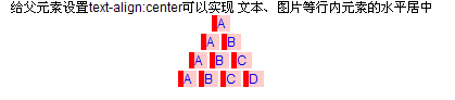
给父元素设置text-align:center可以实现 文本、图片等行内元素的水平居中,但是还有比较复杂的情况,例如我们项目中: